→
Final publication content design
Brief response:
Aim and content
The main aim of the publication is to promote “slow living”, encouraging readers to stop and smell the roses, appreciate and savour the little moments in life that bring happiness and peace. In the midst of living in a world ruled by the clock, we tend to see time as the dictator of life and constantly be working against it, neglecting, ignoring and taking for granted what truly matters-loved ones and moments that remind us what life is truly all about.
Tasting Time serves as a reminder for self-reflection and mindfulness, learning to be more in-tuned with our emotions when it comes to recognising what brings contentment into our lives.
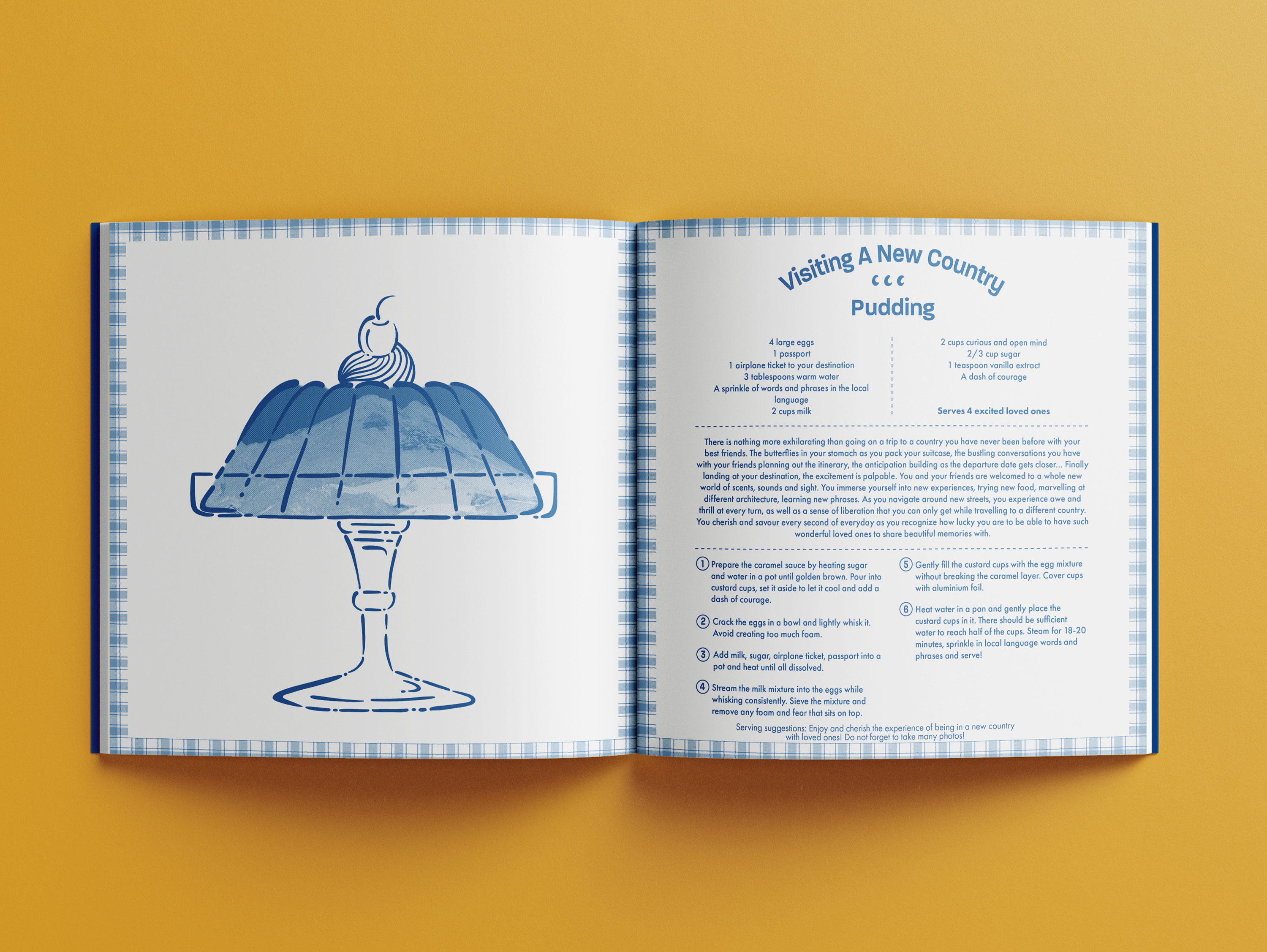
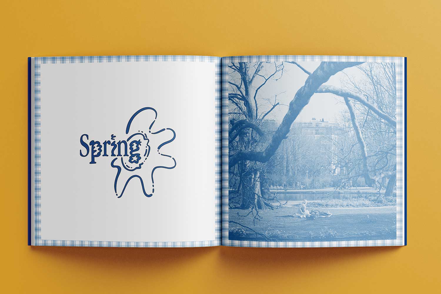
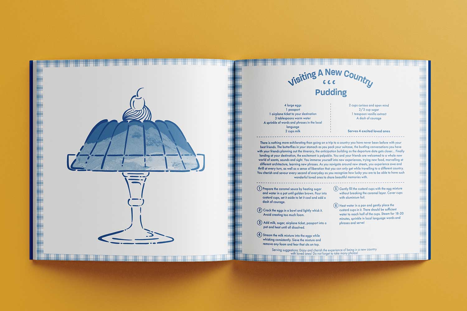
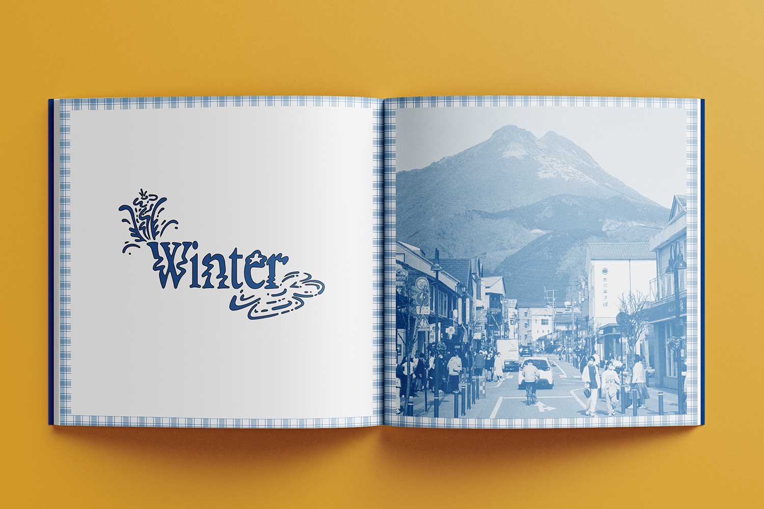
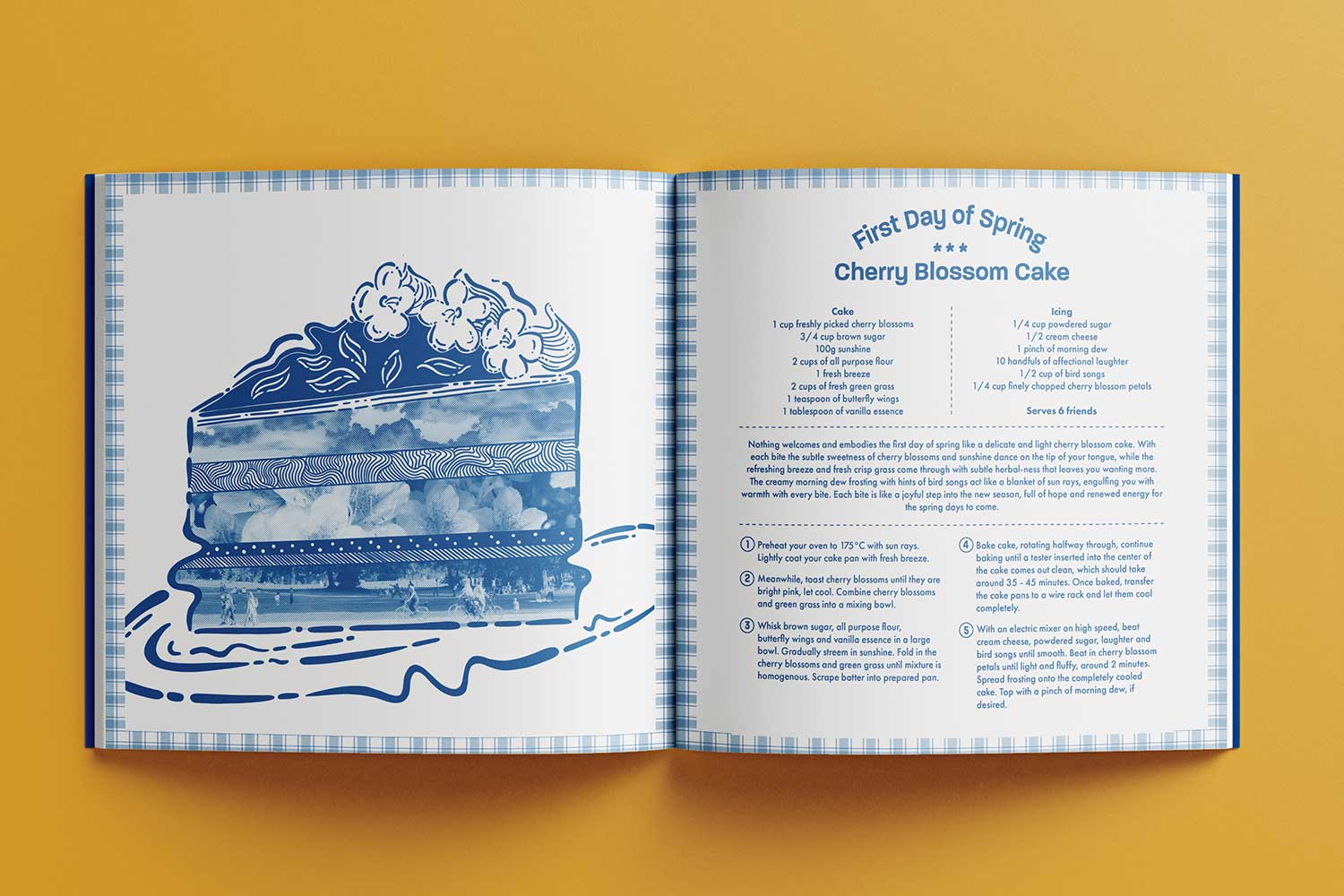
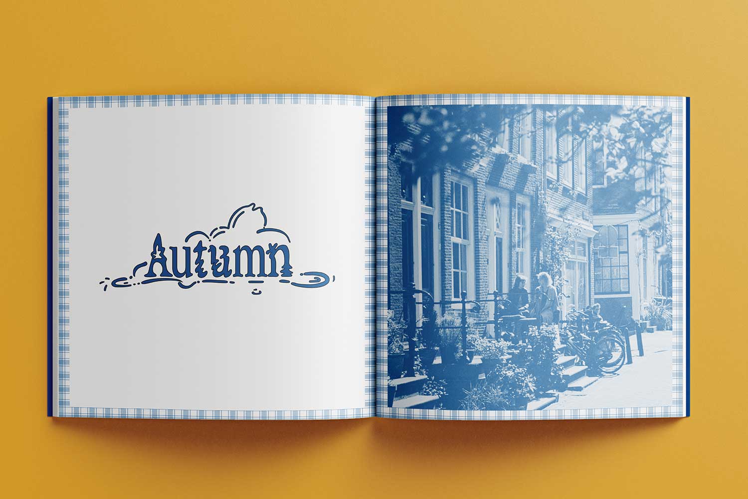
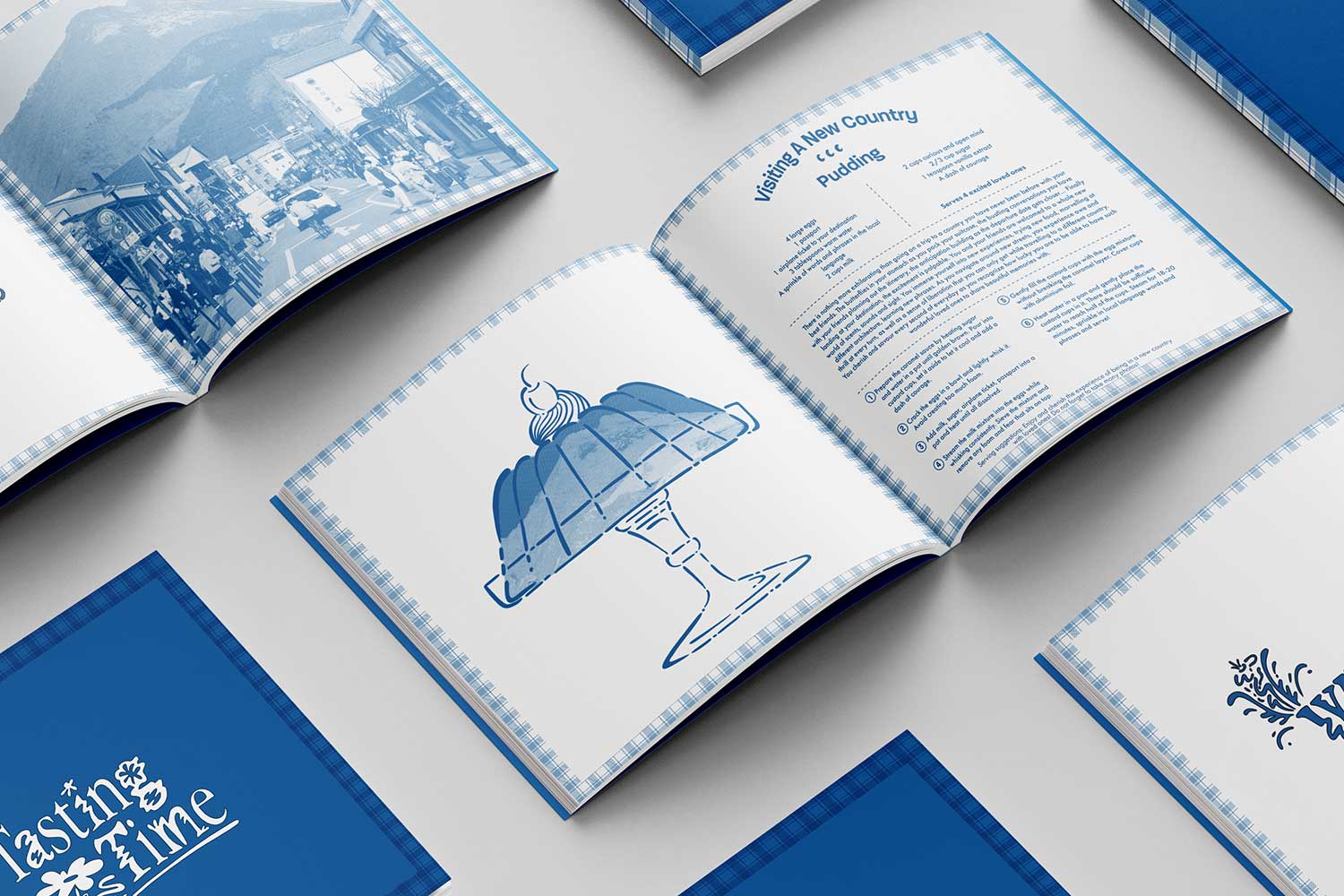
The content will be presented in a cookbook-esque format that is intriguing and inviting, adding a playful, familiar and engaging element in presenting the contents. These “recipes” that mimic actual food recipes is intended to engage and connect the readers in the content in a deeper level and motivate them to dissect the intangible aspects of life, straying away from revolving life around materialistic elements. The “recipes” vary from happy to nostalgic and even remorse or grief, hoping to function as an opportunity to portray these memories in a meaningful yet lighthearted way with the goal of helping the reader find silver linings and find ways of coping with difficult emotions in a healthy and constructive manner.
